Courtesy : www.thespruce.com
Green interior
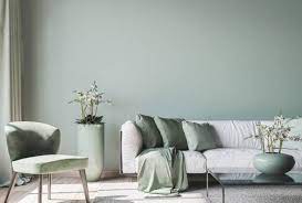
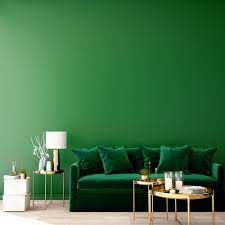
The color green is strongly associated with the beauty of nature. It’s an increasingly popular paint color in all its shades now that everyone is discovering the joys of biophilic design. Shades of green can turn a space into a serene sanctuary, a vibrant playroom, or a dramatic bedroom. It all depends on the shade and the setting. Green is also more versatile than you may think so it’s lovely next to other colors you wouldn’t typically imagine. Get a jump on the greenery trend by enlivening your home with a healthy dose of green paint colors.
Overview
- Color Family: Neutrals to jewel tones
- Complementary Colors: Reds and oranges
- Pairs Well With: Depending on color use pinks and off-whites or taupe and black accents
- Mood: Soft and refreshing to moody and dramatic
- Where to Use: Walls, accent walls, floors, furniture, cabinetry, doors, exterior trim, porches
Here are 10 top shades of popular green paints shared by interior designers who love using botanical-inspired colors inside and out.
- 01of 10Farrow & Ball Green Smoke
:max_bytes(150000):strip_icc():format(webp)/GREEN-SMOKE-No-47-Farrow-Ball-fe1c66e4ea0b4b0bad38518f902772bf.png) The SpruceInterior designer Mark Cutler likes Farrow & Ball’s Green Smoke (No. 47). “It is a deep moody green, not as bright as Kelly green but more intense than khaki; it is the perfect color for a painted floor where you want a deep richness to anchor a room, but not one so bright that it would take over.” He recommends pairing this smoky green-blue with a smoky pink for a unique contrast and off-whites for a classic take.TipIf your worn floors need some TLC, opt for painting them instead of choosing a costly refinishing job.
The SpruceInterior designer Mark Cutler likes Farrow & Ball’s Green Smoke (No. 47). “It is a deep moody green, not as bright as Kelly green but more intense than khaki; it is the perfect color for a painted floor where you want a deep richness to anchor a room, but not one so bright that it would take over.” He recommends pairing this smoky green-blue with a smoky pink for a unique contrast and off-whites for a classic take.TipIf your worn floors need some TLC, opt for painting them instead of choosing a costly refinishing job. - 02of 10Benjamin Moore Limesicle
:max_bytes(150000):strip_icc():format(webp)/Limesicle-Benjamin-Moore-c14b5fb0e87548a9ad2abde7a280d119.png) The Spruce”Green is one of my favorite colors to use because it plays well with so many other colors. It is, after all, one of nature’s neutrals,” says interior designer Janet Lorusso. Pale green like Benjamin Moore’s Limesicle (2145-50) is crisp and refreshing. It pairs beautifully with other light neutrals such as beige and taupe but looks equally as stunning against deep, dark jewel tones.
The Spruce”Green is one of my favorite colors to use because it plays well with so many other colors. It is, after all, one of nature’s neutrals,” says interior designer Janet Lorusso. Pale green like Benjamin Moore’s Limesicle (2145-50) is crisp and refreshing. It pairs beautifully with other light neutrals such as beige and taupe but looks equally as stunning against deep, dark jewel tones. - 03of 10The Spruce Best Home Matcha
:max_bytes(150000):strip_icc():format(webp)/the-spruce-best-home-paint-matcha-9b763114b4e04cbe81fdfccdff054e68.jpg) The Spruce”An inviting shade of green, such as The Spruce Best Home in Matcha (SPR-07), looks amazing in rooms with windows on more than one side of the room,” says John Mochelle, an architect out of New York City. “If you increase the paint sheen level, this medium green color will change as the sun moves throughout the day.” The soft hue is also muted enough to work as a colorful neutral in certain rooms. It’s a perfect shade for living room walls and guest bedrooms.
The Spruce”An inviting shade of green, such as The Spruce Best Home in Matcha (SPR-07), looks amazing in rooms with windows on more than one side of the room,” says John Mochelle, an architect out of New York City. “If you increase the paint sheen level, this medium green color will change as the sun moves throughout the day.” The soft hue is also muted enough to work as a colorful neutral in certain rooms. It’s a perfect shade for living room walls and guest bedrooms. - 04of 10EasyCare Paint Garden Sage
:max_bytes(150000):strip_icc():format(webp)/Garden-Sage-True-Value-Paint-5a3f5a841552431eb7f75072a8d329ef.png) The SpruceA dustier sage green paint color like this is a great option when you want to use a hint of green color, but prefer the look of a subdued neutral. Adding a hazy finish over any hue, such as the Garden Sage (C215) green from True Value’s EasyCare paint line, instantly gives it a sophisticated twist and makes it more complementary to a variety of palettes.
The SpruceA dustier sage green paint color like this is a great option when you want to use a hint of green color, but prefer the look of a subdued neutral. Adding a hazy finish over any hue, such as the Garden Sage (C215) green from True Value’s EasyCare paint line, instantly gives it a sophisticated twist and makes it more complementary to a variety of palettes. - 05of 10Sherwin-Williams Hazel
:max_bytes(150000):strip_icc():format(webp)/Sea-Green-Hazel-Sherwin-Williams-26ecd19f3e3d4446b05a9f0240fa343b.png) The SpruceAlice Chiu, the principal interior designer at Miss Alice Designs, appreciates the calming presence that Sherwin-Williams’ Hazel (SW 6471) green color brings into a space, and it’s considered one of the best shades of green for a bedroom. “It is a beautiful shade of bluish-green that is peaceful and relaxing, perfect for a bedroom,” she says. “With the craziness and chaos in the world, it is a soothing color to unwind to after a long day at work. It can also make a small space appear larger because it naturally brightens up a room with its vibrancy. It is like being in the middle of an expansive sparkling ocean.”
The SpruceAlice Chiu, the principal interior designer at Miss Alice Designs, appreciates the calming presence that Sherwin-Williams’ Hazel (SW 6471) green color brings into a space, and it’s considered one of the best shades of green for a bedroom. “It is a beautiful shade of bluish-green that is peaceful and relaxing, perfect for a bedroom,” she says. “With the craziness and chaos in the world, it is a soothing color to unwind to after a long day at work. It can also make a small space appear larger because it naturally brightens up a room with its vibrancy. It is like being in the middle of an expansive sparkling ocean.” - 06of 10Benjamin Moore Avocado
:max_bytes(150000):strip_icc():format(webp)/Avocado-Green-Benjamin-Moore-ebda6949027940679a6f6bd995b621f4.png) The Spruce”We love the retro vibe of Avocado by Benjamin Moore (2145-10),” says Susan Williams, an interior designer at Siren Betty Design. “This color looks just right with midcentury modern furniture and has a bold personality—’Mad Men’s’ Megan Draper would love it for her living room!” Use this bold, saturated vintage green paint color in a den or try it out in a kitchen for a throwback to the 1960s.TipDepending on the paint manufacturer, avocado green (sometimes called guacamole green) can look slightly brighter or darker and earthier, but it can always look more contemporary when paired with black, gray, or white accents or bold graphic fabrics.
The Spruce”We love the retro vibe of Avocado by Benjamin Moore (2145-10),” says Susan Williams, an interior designer at Siren Betty Design. “This color looks just right with midcentury modern furniture and has a bold personality—’Mad Men’s’ Megan Draper would love it for her living room!” Use this bold, saturated vintage green paint color in a den or try it out in a kitchen for a throwback to the 1960s.TipDepending on the paint manufacturer, avocado green (sometimes called guacamole green) can look slightly brighter or darker and earthier, but it can always look more contemporary when paired with black, gray, or white accents or bold graphic fabrics. - 07of 10Benjamin Moore Webster Green
:max_bytes(150000):strip_icc():format(webp)/Webster-Green-Benjamin-Moore-aff7987fc4f74e16a37bf0c2ae5381d7.png) The SpruceAnother lovely classic shade is Webster Green (HC-130) by Benjamin Moore. Taryn Bone, the principal architect at Interior Designer at Bone Collective Studio says, “It works so elegantly as a kitchen base cabinet or in a moody powder room. It is one of those colors that works in different settings from minimal to traditional.”
The SpruceAnother lovely classic shade is Webster Green (HC-130) by Benjamin Moore. Taryn Bone, the principal architect at Interior Designer at Bone Collective Studio says, “It works so elegantly as a kitchen base cabinet or in a moody powder room. It is one of those colors that works in different settings from minimal to traditional.” - 08of 10Benjamin Moore Soft Fern
:max_bytes(150000):strip_icc():format(webp)/Soft-Fern-Benjamin-Moore-5a6626faecfa465192f1b4903ff25d21.png) The Spruce”I recommend Benjamin Moore’s Soft Fern (2144-40), which is a soft, elegant, light green hue,” says interior designer, Anne Michaelsen. “It is a great green paint color for bedrooms because it is tranquil and exudes a sense of nature while still adding some color and flair.” She recommends pairing the muted shade with warm neutrals or colors with a similar light hue.Continue to 9 of 10 below.
The Spruce”I recommend Benjamin Moore’s Soft Fern (2144-40), which is a soft, elegant, light green hue,” says interior designer, Anne Michaelsen. “It is a great green paint color for bedrooms because it is tranquil and exudes a sense of nature while still adding some color and flair.” She recommends pairing the muted shade with warm neutrals or colors with a similar light hue.Continue to 9 of 10 below. - 09of 10Sherwin-Williams Softened Green
:max_bytes(150000):strip_icc():format(webp)/Softened-Green-Sherwin-Williams-6cea2946d8154718a094afbfa667e77c.png) The SpruceJessica Salomone, the interior designer behind Lotus and Lilac Design Studio loves Softened Green (SW 6177) from Sherwin-Williams. The gray-infused green paint color is a great subtle shade for living rooms, nurseries, and guest bedrooms.
The SpruceJessica Salomone, the interior designer behind Lotus and Lilac Design Studio loves Softened Green (SW 6177) from Sherwin-Williams. The gray-infused green paint color is a great subtle shade for living rooms, nurseries, and guest bedrooms. - 10of 10Benjamin Moore Mediterranean Teal
:max_bytes(150000):strip_icc():format(webp)/Mediterranean-Teal-Benjamin-Moore-9b46479e17f144d6811fa64ba6368916.png) The Spruce”Mediterranean Teal (2123-10) by Benjamin Moore has a luxurious, retro feel—we especially love it for wooden paneling or painted furniture in a living room, or for cabinetry in a kitchen,” says Siren Betty Design interior designer Susan Williams. “It would be gorgeous as a headboard or for an accent wall in a bedroom—it is a very sexy dark green paint color.”
The Spruce”Mediterranean Teal (2123-10) by Benjamin Moore has a luxurious, retro feel—we especially love it for wooden paneling or painted furniture in a living room, or for cabinetry in a kitchen,” says Siren Betty Design interior designer Susan Williams. “It would be gorgeous as a headboard or for an accent wall in a bedroom—it is a very sexy dark green paint color.”


