Courtesy : www.toptal.com
Design and branding casestudy
There are several important aspects to be aware of when working with clients—meeting expectations and deadlines are two of them. At some stage in every designer’s career, there will come along a client who has a pressing urgency with their project. These are the projects that teach the art of meeting deadlines and how crazy it can get.
There are typically two types of projects that every designer will encounter during their career: “I need a user-centered design that corresponds with my project, no strict deadlines; I just want the best solution”… That’s every designer’s dream. But let’s face it; in reality, things are always more challenging.
“I want an outside the box, innovative, and creative solution—good UX, really nice user interface… and I need it yesterday.”
So what happens when you realize there are 30 days to create a logo and design the main brand elements, a website, mobile UIs, and social media adverts/graphics?
After having a small panic attack, you realize that working smart is the only way to go.
Making a plan and thinking things through beforehand will help with productivity, precision, and design quality. As with any successful endeavor, hard work and long hours are some of the mandatory conditions for making it happen.
No matter what, there are always these excruciating questions:
- Is it worth doing with such time restraints?
- Will time constraints lead to poor design quality?
- Would I do a better job if I had more time?
Absolutely yes!
As with any project, there are always upsides, downsides, and constraints that, as designers, we must find a way around and even use to our advantage to come up with creative solutions.
Having a clear idea of the tasks that need to be fulfilled for a successful completion of the project is key, as well as diplomatically letting the client know that the short timeline could potentially negatively impact the design quality overall. However, the pressure of a crushing deadline is no excuse for not putting your best towards your craft—use it to push yourself to deliver the best work possible. A study done by Harvard Business School on creative work done under time pressure concluded this:
These findings indicate that a great degree of pressure may work against creative work, yet at the same time, the study also suggests that a reasonable level of pressure regarding creative work may be useful in helping to produce better designs.
It’s always a challenge to get everything done when you are working as a freelancer with multiple active projects, but it is a great opportunity to be diligent with your schedule and make your limited time work for you! Making remote working work for you is simple, yet not easy. Combine this with a solid plan, and you’ve got yourself a recipe for success.
Days 1-2: First Things First—Plan!
The first step is to break the project down into smaller parts and calculate how much time it will take to finish each stage of the project. Setting goals increases motivation and achievement. The science of goal achievement recommends breaking down your big goal into clear, defined action-steps—doing this will give you a great advantage in your efforts toward achieving it.
Concerning branding design, a good practice is to create several versions of the design so the client has different options to choose from. My personal preference is to create three iterations of logo designs and main brand elements such as typography, color palettes, imagery, and icon sets. Doing this first will allow you to take the concept and visual ideas to the next step.
Create work processes and follow them.
Creating work processes will ease the workflow and the responsibility that comes with every project. The following is my usual approach for a typical design project, be it branding or user interface design:
Research
Find out everything about your client’s business:
- What is the core of their business and what is their main activity?
- Who is their target audience and what are their needs?
- What are their goals and what problem needs to be solved using design?
- Who is the competition and how you can be better?
A questionnaire or design brief is one of the most convenient and efficient ways of collecting the aforementioned information.
Create a Mood Board
One of the things you can use a mood board for is to create the concept—an essential part of any project. Get the bigger picture—take all your research and put it on one big canvas so you can see all the elements that should be incorporated into the designs. There are several free tools that help you create mood boards easily.
If you are not into online tools, using Adobe Illustrator works well as you can create, add, and freely move elements. Think of it as a collage—don’t worry too much about the positioning of the details; you are free to arrange everything to your liking. The primary goal is to see how colors, photos, icons, typography, etc. work with each other—visually and in storytelling.
Day 3: Create a Design Concept
Creating a concept is the next step after completing your mood board and is the foundation of all your future work. A concept is produced as an experimental model to test the viability of design features.
The mood board will be helpful in setting an early visual direction which should correspond to the audience you’re targeting and the aims of the business. The concept will be the basis of your UX direction and is, therefore, a part of the 10 UX Deliverables top designers use.
It’s important to appreciate how important this step is because a solid concept helps in retelling a compelling story, even during the first stages of the project. The main focus should take into account the feelings and experiences users encounter when dealing with the visuals rather than what the visuals themselves are.
One of the industry’s most influential marketing consultants and motivational speakers, Simon Sinek, gave a brilliant TED talk on this subject.
The mood board can help you create a few short slogans or maybe set icon and photo styles into a concept. Since it’s good to have typography that can be read quickly regardless of the medium, it’s also important to consider web and print friendly typography. This is a key element of great design and is also one of the principles regarded by universal design practices.
Day 4: Design Brand Visuals
The brand building process can become tedious and time-consuming if you are caught following the wrong approach from the beginning. Getting started by creating logo iterations is best done once you have an approved concept, and the visual guidance files are done. This will give you the confidence that you are moving in the right direction, and allow you to tackle the branding challenges in a smart and time-efficient way.
It’s essential to make small pen and paper sketches of your design ideas. It will take less time if you sketch first, and then proceed to Illustrator, Sketch, etc. to work on your logo. This step has helped me design three different logo proposals that are all in the visual direction chosen for the brand. This took a few days to finish:
There may be some additional changes and tweaks to the logo design, but once the client has decided on the logo and approved other elements like colors, typography, icons, and photography style, you are done with the basic branding elements.
Days 7-15: Website Design
Brand development includes more than just the logotype—it covers nearly all aspects of design, including the website. Getting started with the website first can be useful, since you can add to the visual concept by applying visual rules and seeing how they work together. This is particularly so when you are creating a website that ultimately has a similar objective and elements to the mobile application.
Sitemap
A sitemap is a list of pages of a website that is accessible to crawlers or users. It can be either a document that is used as a planning tool for web design or a page that showcases the pages of a website in a hierarchical manner.
It’s a big help if a client already has a sitemap because it gives you a clear view of all the pages that belong to a website. If you are awarded a project where a sitemap is needed, you will have to work with the client to put one together.
This could mean asking your client a few questions:
- What is the number of pages on the website?
- What pages are the most important ones?
- Are there any subpages?
This will paint a clear picture of the website’s structure and give you a good idea of the project’s scope.
Copy First
I find it useful to ask the client up front to give me all the copy and content that he/she wants to include on the site. It’s a best practice to make the design work around the copy rather than create the UI first and try to make the copy fit afterward.
The copy first approach saves you and the developers a lot of time. If you go the other way around, you could encounter problems. While useful at times, using dummy text can impact a real project negatively, especially when the design relies heavily on typography and is designed around content. A copy-centric design has no downside and only helps in putting out creative work of exceptional quality.
Homepage Design
By following all the previous steps, you already have general visual guidelines, a sitemap, and copy. Now you can go on to designing the pages for the website.
The homepage is the first thing users see when they come to a website, and therefore, it’s the most important page. Applying the Pareto principle demonstrates that the homepage holds 80% of the design direction (context, typography, colors, repeatable elements, etc.) and the rest of the pages 20%.
It’s good idea to begin your process by grouping and selecting sections for the homepage. Full content and copy usually help me organize the whole page and see which aspects are missing as well as the sections that could be added to maximize the impact and drive users to buy/use the product or service.
To emphasize the service or product, try using prominent call to action sections. They are an excellent way to advertise as well as capture the attention of the users to buy a product, subscribe to a newsletter, sign up, etc.
If the technology, target audience, and the client’s type of business allows, adding motion design like GIF or animation can give the whole site subcontext as well as emphasize the call to action section. However, designers should be careful not to go too far and create something that will take a lot of time to develop.
Days 15-25: Apply Universal Design
Universal design, as described by its developers, “may be applied to evaluate existing designs, guide the design process and educate both designers and consumers about the characteristics of more usable products and environments.”
The concept of universal design is one of the most optimal solutions to use when dealing with a large scope project—a unified concept and focused visual direction for branding, website and mobile applications is of great benefit when designing under time constraints.
The necessity of repetitive elements can be a challenge in itself. This happens when you encounter technical requirements. Responsive website and mobile platforms have a completely different philosophy and set of rules and, therefore, can become a problem if not tackled appropriately. Nevertheless, creating elements that can be used across multiple platforms is one of the backbones of any project’s success—in this particular circumstance, it would not have been possible to cover so many platforms/devices without a unified design that clearly sets the direction for brand development.
The downside of a tight deadline and designing for multiple platforms is that you may not be using the full potential of each of the platforms you are designing for. In such cases, because of the time constraint, a simple “bulletproof” solution that is familiar to the user base could be a valuable idea.
For example: Re-apply one idea on multiple pages and remodel it for every device. The patterns are similar in essence, which is in your favor. It could be in the way you display essential information or invite users to buy a product. In this case, even a search bar could be similar if not the same.
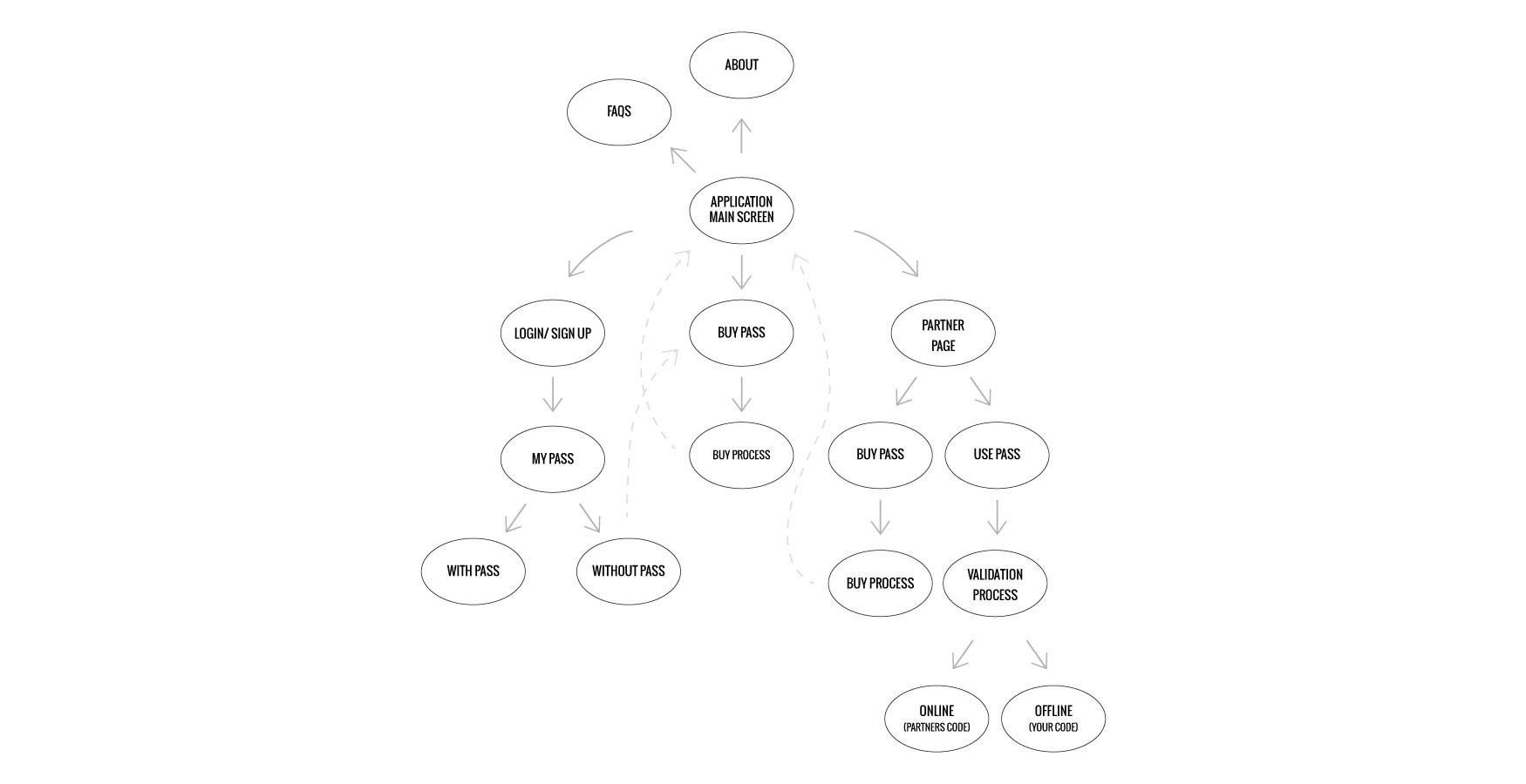
Flowchart
Designing the website is done and you have a clearer vision of the UX for the apps.
One of the ways you can make the UX creation process easier and clearer is to create a user flowchart.

There are multiple methods and tools you can use to create flowcharts—the usual practice is to make graphic diagrams with short titles and, if needed, explanation text. Using Sketch or Illustrator for this is my preference, but any tool that allows you to create and move elements is fine for this task.
Will Little has given a great interpretation of this:
This is where the engineer(s) and creative(s) must work closely together to decide what kind of software tools can best support the intended interfaces and click/swipe behavior, down to every last tab, tooltip, lightbox, icon, etc….
Make It High by Making It Low
Discovering the primary purpose of the app will help define the UX. That could be helping a user buy a product, or maybe helping them use a product—the user experience needs to accommodate that. Low-fidelity wireframes created on paper and then taken to higher fidelity in Sketch or Photoshop can ease the process considerably.

In this case, low-fidelity wireframes were enough since the app is simple and only needed to follow the visual details from the website.
If you can, organize a small test for your UX. You will need a test group of future users in order to see if the wireframes and the UX flow make sense. After the test, you will be armed with valuable insights and you can proceed to the next step (creating a user interface).
Unified Design
After making some tweaks to the UX, you have everything you need for creating a logical and well-defined UI, enabling you to adjust it to the visual requirements of iOS and Android platforms. Since iOS has some very specific design guidelines that may prevent you from getting on the Apple App Store, you have to get to know those rules and carefully check how your design is being implemented during the development stage.
You can create a unified design for both iOS and Android platforms while still using their biggest strengths by following guidelines and rules when designing the UI.
Days 25-30: Create Ads in Sync with Branding
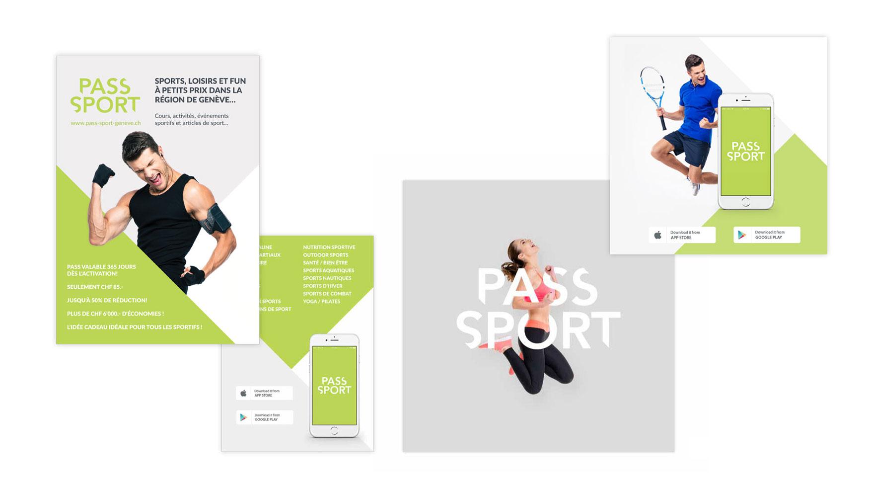
By this point, you should have designed a logotype, branding elements, a website, and mobile applications. Although you designed it all in under 25 days, it’s too early to celebrate since there is still one more step to consider—creating ads for social networks and print. This is where the concept you created at the beginning will be a great help.
Following these tips when designing advertisements and social media materials will greatly enhance the quality, engagement levels, and overall creativeness of your visuals:
- Make use of vivid and bright colors that stand out.
- Showing happy and active people helps with the dynamic and feelings about your graphics.
- Motion, activity, and excitement of people is always an eye-catcher and helps with the feelings transmitted overall.
All of these rules will assist you in creating outstanding graphics for advertisements. If appropriate, make use of the color palette, typography, and other visuals that you’ve used throughout your website, branding, and applications. This will help you be consistent in your designs and will work in your favor when working under time constraints.

Never Commit to a Deadline You Can’t Meet
On occasions, anyone can underestimate the amount of effort and work one project can take—this is why planning every step is crucial at the beginning of a project. Objectives and realistic goals divided into small parts are critical for delivering solid work on time.
Benjamin Franklin put it best: “By failing to prepare, you are preparing to fail.”
At all times, never fail to prepare, and never fail to anticipate the possibility that you have underestimated the job in terms of time required to deliver it. Although clients may have deadlines, you should have the skills that will help you determine whether a project is doable or even worth considering in the first place. However, don’t let this be an excuse for you not to take up a personal challenge which, ultimately, could help make you a more skillful designer and manager of your time.
• • •
